Style your Loloyal widget with custom CSS code.
Loloyal empowers users to design their widget without writing a single line of code. However, a tiny sprinkle of code can add that extra finishing touch to your loyalty widget.
Injecting custom CSS allows you to style your loyalty widget in ways that are not available in the default design options.
How to inject custom CSS

You can copy the changes you made and paste them into the CSS editor. To use the Custom CSS on your widget:
From your dashboard, click Brand Style > Widget theme on the left sidebar.
Click the CSS option.
Add your CSS styles to override the Widget defaults.
Click Save.
Custom CSS requires coding skills and falls outside the scope of our support. However, if there is any doubt, our technical team does provide some technical support and we are happy to help.
This means we’re unable to help further with setup or troubleshooting. Additionally, with a code-based solution, we can’t guarantee its functionality or full compatibility with Loloyal. This includes how it functions with our responsive design or with future updates to our platform.
CSS classes
Custom styles may not always work seamlessly in the widget theme builder because the HTML structure of blocks may differ in the editor. To ensure that your custom styles are correctly applied, it is recommended to test them in Preview mode, which replicates the same HTML structure as published widget.
Avoid using class names that are not listed in the table below. For instance, class names such as sc-a3e5684a-0, styled__ContentH3-sc-aw1rsf-4, cwaPRn, etc., are automatically generated and subject to change, potentially causing your CSS rules to break.
| Description | CSS Class |
|---|---|
| App | .loloyal-app |
| App Banner | .loloyal-banner |
| Navbar | .loloyal-navbar |
| Navbar Text | .loloyal-navbar-text |
| Navbar Back button | .loloyal-navbar-back |
| Card Block | .loloyal-card |
| Card Item Block | .loloyal-card-item |
| List Item Block | .loloyal-list-item |
| Close button | .loloyal-close |
💌 Didn’t find the class you’re looking for? Let us know by chat!
How to import Google Fonts


4. Combine into the correct CSS according to the rules below to populate the input area of the custom CSS.
Example: Add a Google font to the Widget
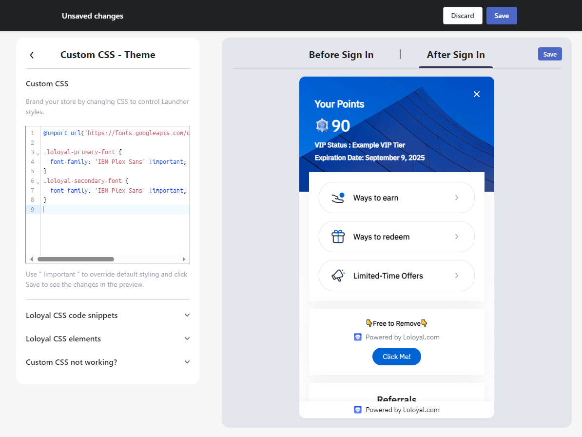
/**
* @import Must be on the first line!
*/@import url('https://fonts.googleapis.com/css2?family=IBM+Plex+Sans&display=swap');/*** font-family: 'Your Font' !important*/.loloyal-primary-font {
font-family: 'IBM Plex Sans' !important;
}
.loloyal-secondary-font {
font-family: 'IBM Plex Sans' !important;
}
Example: Add a Google font to the Launcher
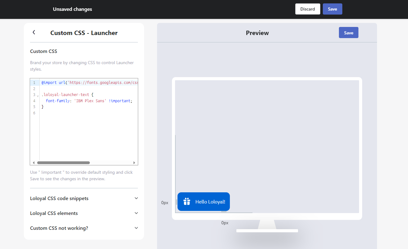
/**
* @import Must be on the first line!
*/@import url('https://fonts.googleapis.com/css2?family=IBM+Plex+Sans&display=swap');.loloyal-launcher-text { font-family: 'IBM Plex Sans' !important; }
Code snippets
Not familiar with Custom CSS? We prepared a set of pre-made code snippets for you, which you can simply copy and paste in the CSS or code injection box.
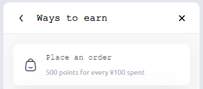
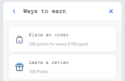
Change the breadcrumb arrow, back, and close button colors
.loloyal-close use {
  fill: #1246FF !important;
  color: #1246FF !important;
}
.loloyal-navbar-back use {
  fill: #1246FF !important;
  color: #1246FF !important;
}
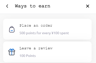
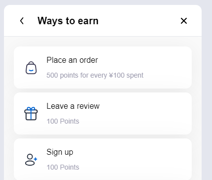
Add a browser safe font to the Widget
.loloyal-primary-font {
  font-family: Arial !important;
}
.loloyal-secondary-font {
  font-family: Arial !important;
}
Changing the size of the Join now Button
.loloyal-join-btn { width: 240px; }


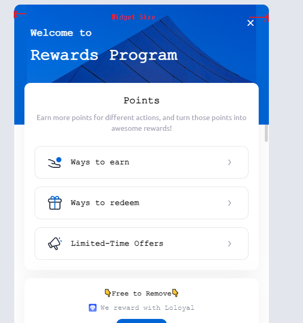
Adjusting the size of the Panel.
Tip: This function cannot be preview in this window.
.loloyal-iframe-page { width: 500px; }
Hiding specific areas of the Widget (Example: Limited-Time Offers)
.loloyal-limited-time-offers {
  display: none;
}

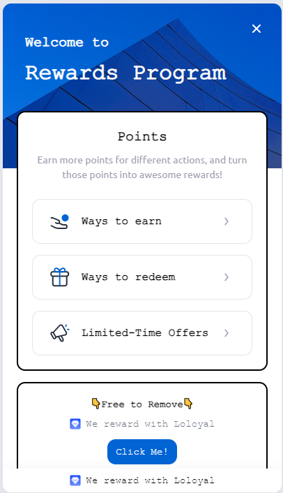
Changing colors and styles of elements
.loloyal-card {box-shadow: none; border: 2px solid black; }
Changing colors of system icons.
.loloyal-svg-icon use {
  fill: pink;
  color:pink;
}
Custom CSS not working?
Try to add
!importanton every line before;Some CSS rules only work in
Previewand published mode. You will not see the changes in the widget theme editor.
